Hydro Leader: Please introduce yourself and Worthington Products as a company.
Paul Meeks: I started Worthington in 2001 as a manufacturer of waterway barriers for debris control. We continue to offer debris barriers, but we have grown to also offer public safety floating barriers, fish guidance systems, and ice booms. After recognizing a need for quality signage around dams, we created a signage division in late 2019.
Hydro Leader: What was the need that you saw that led you to start producing dam safety signs?
Paul Meeks: Too many Americans were dying at our nation’s dams, less from negligence than from being in the wrong place at the wrong time and not knowing what the dangers were. At the same time, in Canada, which has signage guidelines as part of the Canadian Dam Association’s (CDA) Guidelines for Public Safety Around Dams, there were maybe one or two deaths per year. One dam in Tennessee had two deaths at the spillway in 2020 alone.
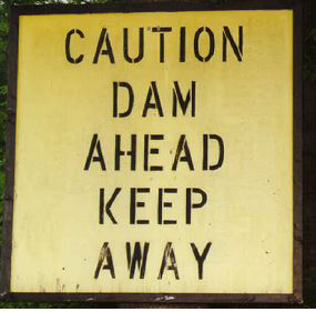
During our visits to hydro plants across America, we had a chance to look at the signage that they had, and quite frankly, the signs that we saw stunk. We even created a video titled “Your Dam Signs Stink!” to drive home the point to dam owners. They were every different size and color, had varying fonts and text alignments, and displayed no consistency in messaging. They looked as if the graphics art department had made the signs just so that they looked appealing. There was zero consistency among signs at individual power plants belonging to the same company, to say nothing of consistency across the nation. We saw a need for proper signage standards that would ensure that if you’re boating at a Duke Energy facility in North Carolina and then take your boat to a Georgia Power facility in Georgia, you would see some consistency in signs.
We looked at the sign standards of agencies like the Federal Energy Regulatory Commission (FERC), the Federal Emergency Management Agency (FEMA), and others, but they were outdated and, in our view, not very effective. We realized that the government was interested in this. FEMA and FERC were working on updated sign standards, but the wheels of government do not typically move at a fast pace, and I did not think we should wait. Worthington took the best practices from the United States and North America and decided to start offering proper signage based on principles that we hope may end up resembling the eventual standard in the United States.
Here is why I was not willing to wait for new sign guidance at dams and why this issue is so important to Worthington Products: On February 20, 2020, at Pickwick Dam in Hardin County, Tennessee, a 45‑year-old father, his 15‑year-old son, and his son’s 15‑year-old friend were participating in a local high school fishing tournament on the reservoir above the hydroelectric dam. At the time, the dam was spilling water. The motor on their boat died. There were open floodgates, ineffective signage, and no boat barriers that we are aware of. The boat went through the spillgate. All three perished. But the damage goes beyond three lost lives. Think about all the family members and other people forever affected by this horrible—and preventable—incident. It is not an isolated event.
When I talk to engineers and dam owners, I pose this question: “If it were in your power to save 40 lives, would you do something about it?” The obvious answer is yes. Then I ask, “What if you could save 20 lives, 8 lives, or just 1 life?” The question that follows is, “How can a dam safety engineer or power plant superintendent save lives?” I believe a good starting point for operators is to install proper signage to alert the boating public to the dangers of these dams.
Do you think that you could walk up to the front door of a coal-fired, gas-powered, or nuclear power plant? You couldn’t, because there are fences and security all around those facilities. Yet if you’re on the water, you can drive your boat right up to the intake of a hydroelectric power plant or park your boat directly in front of its spillgates. You can even go below the dam and park your boat in its discharge canal or below the spillgates. People don’t go out to these places to die, but if the motors on their boats fail or they aren’t aware of the dangers, there is nothing to prevent them from going through or getting swamped.
I believe signage—proper signage—is a good starting point. Two weeks ago, a woman called our office. Although her story was upsetting to hear, it reinforced our conviction that what we are trying to do with signs is the right thing to do. She and her husband were kayaking on a small river near Zanesville, Ohio, in June 2019 and were approaching a low-head dam. A low-head dam looks like an infinity pool; you can’t tell there’s a dam there until you’re on it. She pulled off the river, but he was ahead of her and didn’t notice it. In her words, by the time he saw the tiny sign on the dam, he was already going over it. Regrettably, she lost her husband on that day. Having proper signage to alert people to the dangers of dams can save the lives I asked the dam engineers and owners about.
Hydro Leader: What are some of the standards and best practices that you compiled, and what standards did you use to build your own signs?
Paul Meeks: Here’s what we learned very early on. The standards already existed; they just needed someone to consolidate them into a meaningful format directly addressed to dam owners. Take, for example, the U.S. Army Corps of Engineers’ EP 310 sign standard. It is a work of art. However, much of it doesn’t apply to hydropower plants, so it is a cumbersome read. Many of the sign standards in the CDA’s Guidelines for Public Safety Around Dams also derive from EP 310. In turn, both EP 310 and the CDA Guidelines ultimately point back to the American National Standards Institute (ANSI) sign standard Z535.2. Like EP 310, ANSI Z535.2 is a long document. How long? Try 80–120 pages long. Folks quickly get lost in it. What we did was take the ANSI standards and consolidate what mattered to dam owners. We have to thank the good folks at Ontario Power Generation (OPG), who really gave of their time to help us understand these standards.
We see the craziest signs at dams. Sometimes the legal folks are given free rein, and the result is a novel on a billboard. Signs don’t need a ton of words. What they need is to be easily and quickly understood. So here is the basic premise behind our signs:
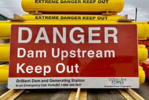
First, the sign should have a signal word which is either DANGER or WARNING. Ninety percent of your signs are going to use the word DANGER.
Second, the message below the word DANGER should tell you what the danger is. Keep the message simple. Use wording like dam ahead or dam upstream.
Last, now that you’ve told the people what the danger is, you need to tell them what action you expect of them. Here, it is important to keep the message panel simple. Action messages like keep out or keep away serve the purpose. Keeping the message text simple and to the point allows the text height to be maximized for greatest upstream visibility.
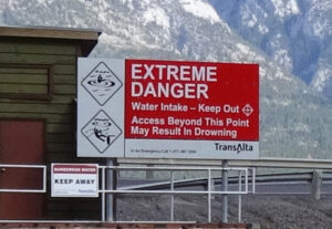
Now that we’ve established the message, the next question is how to design and format the sign. If it’s a danger sign, it should be on a sufficiently large panel, typically made of aluminum; it should be on retroreflective sheeting; and it should be red with white lettering, so that it’s visible in low-light conditions. The lettering should be left aligned, not centered—it takes 14 percent longer to read a sign that is centered than a sign that is left aligned.
When OPG was doing its research on sign wording, it actually conducted focus-group studies to determine what words and messages worked with the general public. I think the work by OPG was excellent and the message text is spot on. However, I also believe more work is needed in this area and that focus group studies should be conducted in the United States to make sure that the message resonates with someone in Alabama as much as it does with someone in Montana.
Hydro Leader: In addition to some standards and guidelines from agencies like the Army Corps, are there existing legal requirements for dam owners to have signs?
Paul Meeks: I am not aware of any legal requirements, but there are some existing guidelines. For instance, FERC licensees file a public safety plan that includes signage. However, FERC will not dictate the type of signage, where it is to be placed, its size, or anything else. Some states, namely Indiana and Pennsylvania, have in the past 15 months passed legislation requiring signage at low-head dams.
After many incidents, the survivors file lawsuits against the dam owner or utility, and even when the owner is not found liable, the cost of defending themselves is significant. At the end, the utility will likely enact a safety program anyway. Why do people have to die before we do what is right?
Hydro Leader: What can you tell us about the overall signage program that a dam should have?
Paul Meeks: There should be multiple signs, but not overkill. Sign programs are costly to initiate and costly to maintain. Dam owners should have land-facing and water-facing signs. Let’s start with water-facing signs. These signs should be placed above the danger zones, not within them. The danger zone is the area near the dam itself where the water velocities become much higher or turbulent and a boater’s ability to get to shoreline is reduced. The risk of injury or death increases significantly in the danger zone, and you don’t want people going into them. You want them to be able to turn left or right or to turn back upstream before the flows get too high. The message text on the sign should be visible from the middle of the reservoir or river. Some of these signs can get large. At Conowingo Dam in Maryland, there’s a sign larger than a highway billboard. Some of the Army Corps signs on the Ohio and Mississippi Rivers are massive. Signs of that size can get hugely expensive, so we need to be cognizant of that and bring some common sense into the signage program.
The same principles apply downstream of the dam. You still have a danger zone—a lot of the deaths we see happen downstream of dams. I read an article this morning about an incident in July 2019 at Pickwick Dam. A man was fishing in a 16‑foot aluminum boat, the motor probably died, and the boat was drawn into the boiling water coming out of a spillgate. The boat went under, and this gentleman lost his life. This same dam had a similar event in 2018 and two in 2020. Signs help make people aware of those dangers so that they keep themselves out of harm’s way.
Many owners mount signs directly above the spillgates. I am not a fan of this placement location, but the signs can be effective provided the lettering is tall enough that people can see it from 300 feet away or more. That may require a large sign.
For shoreline signs, you want to look for areas where the public has access. That involves doing a public safety audit of your property. The simplest aspect of it is finding points of access by walking the banks or any fence lines to find areas where people are coming in, where they’re setting up fires, or where you see beer cans laying on the shore. Those are areas where you might want to have smaller signs—12 by 18 inches or 20 by 30 inches, for instance— that would inform people on foot of the dangers in the area they’re heading toward.

Worthington’s video,
“Your Dam Signs Stink!”
Lastly, if you have boat launches above any of these dams, it is helpful to put informational signs there.
Hydro Leader: How should these signs be best combined with other safety tools, such as barriers?
Paul Meeks: That comes down to conducting a public safety audit. Is the risk high that someone is going to get injured or die? If it is, then you certainly want to augment your signs with barriers that are actually going to keep people out, such as continuous boom or buoy lines. Downstream of the dam, you might want to have audible devices or sirens to alert people when you’re going to be opening spillgates or starting up hydro units. If you have sirens, you also want to have a smaller attachment underneath your primary downstream danger sign that tells the people what the siren means.
Hydro Leader: Worthington also produces floating signs. How should those be used?
Paul Meeks: A floating sign is good if you have a large reservoir. If your reservoir is 2,000 feet or more across, you would have to use exceptionally large signs at each end of the reservoir for them to be easily visible, and that would be costly. In that case, you may want to put special floats with signs mounted on them in your reservoir, maybe one every 300 feet. You must be careful with floating signs, because a big, flat sign can act as a sail. You have to make sure that the flotation is sufficient to prevent the sign from flipping over during high winds or wave action.
Hydro Leader: What are some of the biggest mistakes that dam owners make with their signs?
Paul Meeks: Really, the biggest mistake we see is lack of consistency. There are a lot of signs made by people with good intentions but who approach sign design more from an artistic point of view than a utility point of view. We see signs with fun fonts, centered text, and lots of verbiage. I saw a sign in Pennsylvania that listed you everything you could not do. After I read through this diatribe, which was obviously written by an attorney, I finally realized that all they were trying to tell people was, “Hey, there is a dangerous dam downstream, and you need to keep away.” If you try to be specific and say no fishing, a lawyer is going to split hairs and say, “Well, that means you can go swimming.” Forget about covering every possibility. Just get to the basics. What do you want the people to do? If you want them to keep out, say keep out.
Hydro Leader: Do you support the regulation of dam signage?
Paul Meeks: I’m not a fan of government regulation. We have enough regulations on the books. I would like to see more dam owners recognizing the importance of public safety around dams by taking concrete actions to safeguard the members of the public who recreate in, fish in, and enjoy the great water resources we have in this country. I look forward to agencies like FERC and FEMA updating their guidance for dam owners in areas like signage and warning devices. When I visit lakes in New Brunswick, Canada, and then travel to a lake across the country in British Columbia, I can guarantee you with 95 percent confidence that the signs I see on the east coast of Canada will be nearly or completely identical to the signs on the west coast. If it’s a danger sign, it’s going to be red with white lettering, it is going to be retroreflective, and it’s going to have the same simple message. This is intentional. The results are that Canada has a dramatically lower rate of incidents and fatalities at dams than the United States. I would like to see those same results in the United States, and I am using my company’s reach to get that message out.
Hydro Leader: Is there anything else you’d like to add?
Paul Meeks: Dams are great resources. Let’s let people recreate around these facilities in a way that is safe for them and for the dam owners by helping them recognize what the dangers are. Signage is a great, easy way to do that.
Paul Meeks is the president and CEO of Worthington Products. He can be contacted at pmeeks@tuffboom.com or (330) 452‑7400.